Data Visualization
About This Project
This project was completed through Northwestern University’s Data Science and Visualization program.
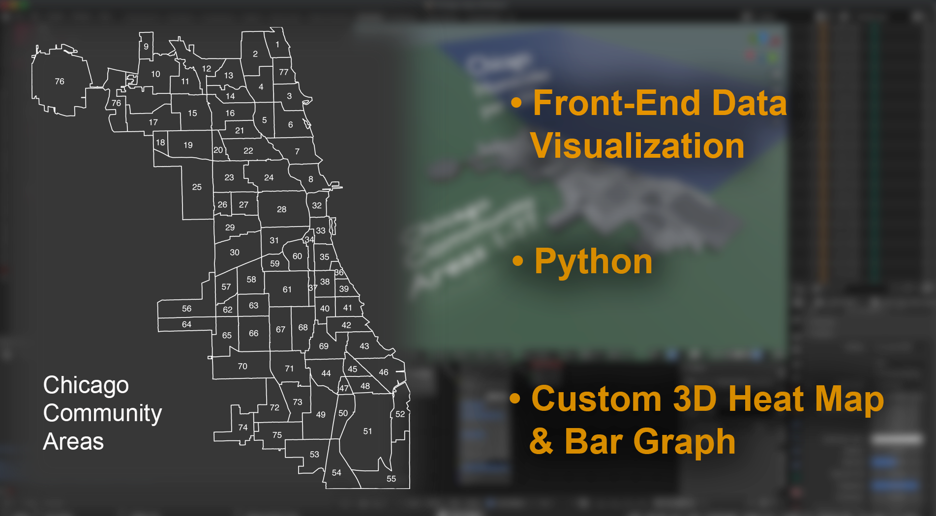
I focused on Front-End Data Visualization for my section of our project. I started with Python, Pandas and Jupyter Lab, to analyze and organize datasets downloaded from the Chicago Data Portal. Our project objective was to analysis the correlations between Crime, Health, and general Well-Being in the 77 Chicago Community Areas.
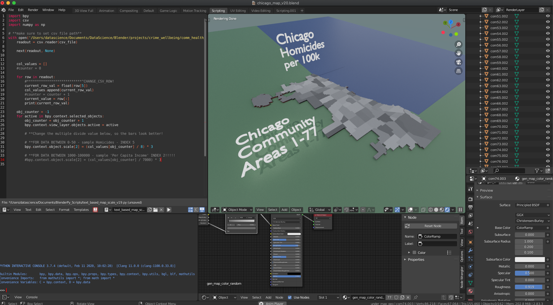
- I used the 3D application Blender, which can model and be manipulated by python internally.
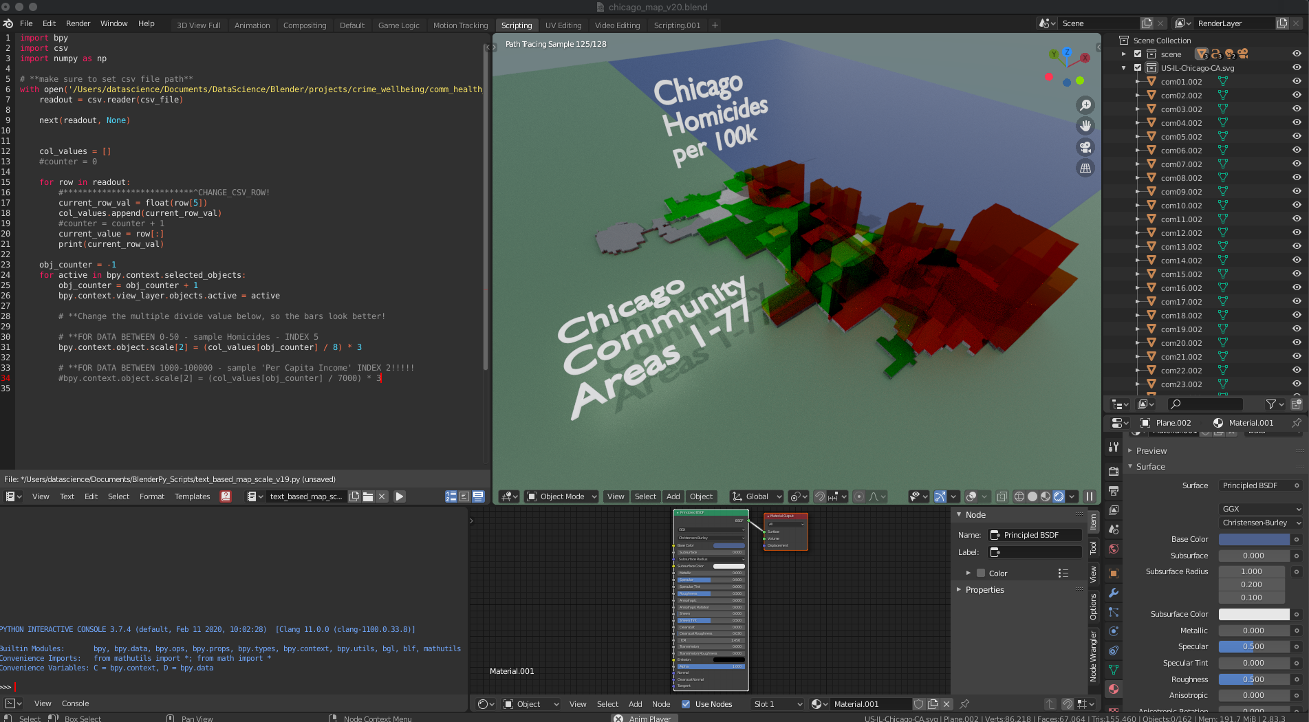
- Since we narrowed down our data sets to Chicago and specifically grouped by the 77 neighborhoods. I wanted to create a unique heat map to quickly illustrate the disparities or prosperities geographically across the 77 Chicago areas.
- I wrote a custom python program that iterates through an imported csv and also iterates through geometry of the city neighborhoods and applies the data to the z scale of the geo.
- A also made a scale driver to change the bar color by height. The results are pretty cool. And to be clear, these are not buildings, but Chicago neighborhoods raised like bar charts. A heat map you can navigate around in 3D. Which quickly gives you an overview of any metric you choose.
- A refined visualization like this could be used as a 1st engagement tool to your data, for let’s say a potential customer or general public. This visual may have less descriptive analysis built in, but it attracts the user to dig deeper into your data.
- If you’d like more information on this or to keep up on my Data Science projects in general, please visit my GitHub!